Tim's Advanced Web Authoring Class Blog

This blog is for IDD 410 at Quinnipiac University with Prof. Greg Garvey. This will include comments, information, and criticisms about web authoring. Also included will be reactions to the book "Site-Seeing: A Visual Approach To Web usability" by Luke Wroblewski.

Wednesday, September 27, 2006

Mission Statement for QU Branches


http://management.about.com/library/howto/ht_stmt.htm
http://www.tgci.com/magazine/98fall/mission.asp
http://myphliputil.pearsoncmg.com/student/bp_turban_introec_1/MissStmt.html


There are three links about how to write a mission statement.

Here is the mission statement for QU Branches:

The objective of the Quinnipiac Branches web site is to reach current and future students as well as alumni. In addition to be visually stimulating in a professional manner; it will help its visitors be up to date on important events and what is happening in the QU Branches community. Whether it is learning about the staff, different programs and events, learning more about this organization, or prayer requests. Since the QU Branches web site will also always be getting new and exciting content to encourage its visitors to return on a regular basis.
Site Seeing: Chapter 2

Here are some of the key points from chapter 2:

-Be organized. Sure it can be rewarding to sift through a pile of stuff on occasion and find something absolutely wonderful, but most of the time we don't have the time or patience to look through piles of things if we are looking for something particular. Web sites need to have their content in organized groups.

-Navigating a web site is essential. The user wants to immediately be able to get where they are going on a web site without getting lost. A web site should be organized progressively, where large groups have smaller sub-groups underneath them to keep them organized.

-Presentation. The presentation of a web site can give it a very unique personality and attract a certain type of user and how it speaks to the audience. The example in the book is: "Is it screaming, "Get excited about football!" or does it calmly say, "Don't worry, I know getting a home loan is difficult, so I'm going to make it as easy as possible for you."

-Designs of a site also need to be taken into consideration for the entire world (in a sense). Not everyone is using the latest and greatest web browser or computer. Sometimes things can look different across different browsers, especially older ones.

-Along the line with keeping in mind older browsers, does the site being designed require certain technical standards? Does it need a broadband connection and a fast computer with a Flash plug-in? Or is it viewable to someone who is on a dial-up connection? Again, it is time to think about the audience to this site and what types of hardware and internet connections they might have.

Thursday, September 21, 2006

Mission Statement for my Personal Web Page

So I'm not technically sure what the mission statement for my own personal website should be...but perhaps someone will comment with some ideas on how to make this better.

Mission Statement:
This web site is designed for the user to get a closer look into my life, without getting too close for comfort. Here the user will be able to find some of my design work (and a resume showing that I'm trainable until I actually get the piece of paper to prove it). The work displayed here is always open constructive criticism and can be emailed to me if the user chooses to do so. Along with a display of my work, some of my hobbies can also be found here. Currently my main hobby (when I have time and money) are cars and computers, but don't be surprised to see something entirely random pop-up as an interest of mine. My hope for the design of the site is to show my personality and feeling at the time it was designed. Ideally, I hope to go through several designs throughout the course of the web site's life. The content of this site will be light-hearted and sometimes sarcastic (so don't take everything I say literally). With all of that said, please enjoy your visit. Thank you.

Ch 1 of the Text Book

Here are 5 key points from Chapter one of the lovely textbook that we are using.

-Know what you want to say: The first time a web site is visited, several things run through the users mind. What should be immediately portrayed is, what this web site is about and for. I know when I come to a web page and I can't tell what it is for, it is frustrating and I generally leave the page quickly.

-Know your targeted user or audience: A web page should be easily identifiable by someone of the audience you're looking for. Thats not to say it should follow a cookie cutter design for the topic the web page is about, but based on the easily viewable content, they should have an idea as to what the web page contains.

-What is the user looking for? Is the user going to be able to access what they want to easily? What would this user generally come to the web page for? Is it easy for them to find what they need? Or is it buried behind a dark trail of links?

-A site should be organized. "Unlike books and cities, the Web lacks any "real" physical structure. As a result, web users are often landmark-less and unable to understand "where" they are within a site." This is where navigation of a web site is very important.

-Determine the content of the site. What information is needed. Where should it go? The audience determines the content of the site. Some of the content could be very irrelevant.

Tuesday, September 12, 2006

Site Seeing: Preface

So this week I'm going backwards since I can't follow instructions. Here are a few key points from the preface.

The web is a means of communication. Since it is a way of communicating, there are some 'technical' guidelines that should be followed for the sake of usability. Websites should also be organized in an easy to use manner. This has to do with its structure and navigation systems. The visual representation of a site is also important. It pulls the user into the site and gives a personality to the site.

Thursday, September 07, 2006

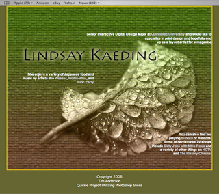
Lindsay Kaeding's Mock up

Lindsay Kaeding's mock up for her site.

Wednesday, September 06, 2006

Site Seeing: The Beginning

Back when I was a wee lad, rather, just about to enter my teenage years we received the internet at home. As I frantically searched the web for the latest video game codes, I remember how some of those web pages were setup. I had entered the web during the beginning of the "Image & Table" era according to Wroblewski. There would be a main image of perhaps some famous video game character, like Mario or something and a neatly organized collection of links in a table format. I could navigate through the entire site through this table and with the help of my back button. Now after looking at all these different era's on the web, they all now stand out in my mind and we have come a long way with web web development.

When we create a website, we need to know what it is going to say, or the content of it. Not just the text that is going to be on the site, but also how it should be presented, the color choices, the fonts, graphic images, etc. This is helped to be determined by finding the target audience for the website. What is the audience looking for? What about the client? What is the purpose for someone to go to that site? The example in the book talks about a user going to the Williams-Sonoma website. Their website is dedicated to cook-ware and food recipes. That means that the target audience is most likely a person who has at the very least, a little bit of knowledge about cooking and food. So the appropriate lingo can be used. If the user is looking for cook-ware to purchase, making it easy to find the desired cook-ware and to purchase it are a main concern, as well as displaying the object the best it can be via the web browser.

After figuring out what the desired outcome and purpose of the site is, collect all the thoughts on paper and develop a short mission statement to help outline what the site needs to do and who it is for.